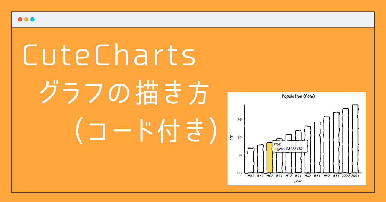
python で 手書きのような図が描ける「Cute Charts」ですが、前回の記事ではこのCute Chartsとは?や簡単な使い方を説明していきました。
今回は、前回の記事ではまとめきれなかった、グラフの具体的な描き方をサンプルコード付きで紹介していきます!

グラフを描いてみる!
アジアの人口の推移データを 棒グラフ・折れ線グラフ・散布図で描いていきます!
pop : 人口 (population), year : 年
インポート文・データ準備
import cutecharts.charts as ctc
import pandas as pd
import plotly.express as px

df = px.data.gapminder()
df_asia = df[df['continent']=='Asia'].groupby(['continent','year']).sum().reset_index()
df_asia
棒グラフ (Bar)
- ctc.Bar() : タイトルの設定, グラフの幅・高さを設定
- set_options : 横軸のラベルを listで設定, x,y軸の軸ラベルを設定
- add_series : 縦軸のラベルを listで設定, カーソルをあわせたときにでるテキストの設定
- render_notebook : notebookに出力
chart = ctc.Bar('Population (Asia)', width='600px', height='200px')

chart.set_options(labels=list(df_asia['year']),
                  x_label='year',
                  y_label='pop',
)

chart.add_series('year',list(df_asia['pop']))

chart.render_notebook()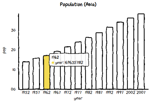
折れ線グラフ (Line)
基本的な設定は、棒グラフの設定と同じです。違うところは、1の ctcに続く関数名くらいなので、グラフごとに描き方を1から覚える必要はないのは良いですね!
- ctc.Line() : タイトルの設定, グラフの幅・高さを設定
- set_options : 横軸のラベルを listで設定, x,y軸の軸ラベルを設定
- add_series : 縦軸のラベルを listで設定, カーソルをあわせたときにでるテキストの設定
- render_notebook : notebookに出力
chart = ctc.Line('Population (Asia)', width='600px', height='200px')

chart.set_options(labels=list(df_asia['year']),
                  x_label='year',
                  y_label='pop',
)

chart.add_series('year',list(df_asia['pop']))

chart.render_notebook()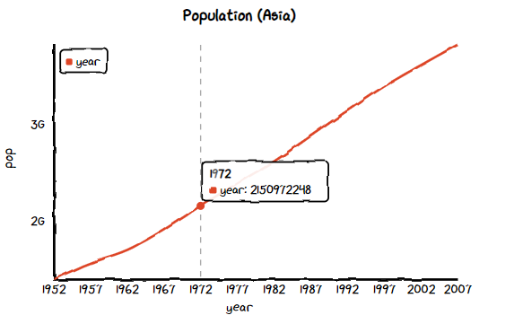
散布図 (Scatter)
- ctc.Scatter() : タイトルの設定, グラフの幅・高さを設定
- set_options : 横軸のラベルを listで設定, x,y軸の軸ラベルを設定
- add_series : 縦軸のラベルを listで設定, カーソルをあわせたときにでるテキストの設定
- render_notebook : notebookに出力
chart = ctc.Scatter('Population (Asia)', width='600px', height='200px')

chart.set_options(
        x_label='year',
        y_label='pop',
)

chart.add_series('year vs population',[(z[0], z[1]) for z in list(zip(df_asia['year'],df_asia['pop']))])

chart.render_notebook()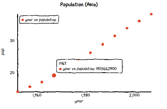


コメント